

Venmo Recurring Payments
My Role (independent)
Research, information architecture, interaction design, UI design, user testing
Timeline
80 hours, February 2021
Tools
Figma, Whimsical, Zoom
Background
For this project, I wanted to investigate how quarantine restrictions may have impacted Venmo usage. My focus would be researching and designing a new integrated feature that could add value to the Venmo experience for the remainder of quarantine, but would also be valuable for users and the business long-term.
The problem
At the moment, Venmo usage is more driven by social activity and one-time payments but isn’t addressing repeat payments that might take place more in a household setting (this is especially amplified by the current pandemic). Current Venmo users are often sharing monthly bills with other people and need a way to better manage these repeat payments.
How might we create a solution that allows users to split and keep track of their shared bills within the Venmo app?
The solution
A recurring payment feature was seamlessly integrated into the app experience, allowing users to easily schedule and keep track of repeat payments within Venmo.
Note: This is a hypothetical project. I do not work for Venmo, but the final design and process was based on real user research.


Research
Step 1
Goals
1. Research market trends and competitor peer to peer payment apps
2. Identify and better understand Venmo’s customer base, learning more about their needs/goals/frustrations
3. Validate that using Venmo to make repeat payments is a problem users are trying to solve
Methodologies
1. Competitive analysis: Research and better understand trends, strengths, and weaknesses in comparable payment apps
2. Secondary research: Look at Venmo app reviews to better verify user wants/needs
3. User Interviews: Understand customer’s Venmo experience, discuss their last 10-15 Venmo transactions
User Interview Takeaways
Users do need a way to make recurring payments
In the interviews, many participants mentioned using Venmo to pay their partner or roommates rent, and other household bills.
People don’t enjoy other P2P apps as much as Venmo
Participants mentioned using other peer-to-peer payment apps for their recurring bills, and very often not enjoying the experience or not liking having multiple payment apps.
Users prefer autopay to not worry about bills
People want to make bill pay less manual and more automatic.
Users really do not like the Venmo social feeds
Without being prompted at all, nearly every participant mentioned how much they disliked the social feed within Venmo.
Interview sound bites:
“During quarantine, I’m not going out to eat with other people, so I most often just pay one person now (my partner).”
— Research Participant
“I use auto-payments as much as possible. I get stressed out when I have to wonder if I paid a bill or not.”
— Research Participant
What reviews say
I spent a short time looking through Venmo app reviews to look for any recent mention of bill payments or monthly patterns.
Supporting the initial competitor research, there were specific requests for a recurring payment feature, as well as users talking about how they use Venmo to manually request for bill splitting every month.
“I would like it better if I could set up automatic recurring payments”
February 2021
“…We used Venmo to encourage our post-college sons to make monthly Venmo payments for their cell phone services.”
February 2021
“…However, I’d use the app much more often if they allowed recurring payments to be set up.”
September 2020
Define
Step 2
Now that the research was supporting value in a new recurring payment feature, it was time to better define our goals, users, and architecture.
Adjusting current architecture
Deciding the best spot for this feature integration proved to be a thoughtful process, and more time-consuming than I’ve experienced in previous projects. I wanted to make sure the feature integrated realistically, without disrupting any of the other features that Venmo users enjoyed and knew well.
Keeping payments familiar
Multiple paths to the same spot
Reminders vs Notifications

See User Flows in greater detail
Ideate
Step 3
Referring back to the flows and architecture, I started sketching out some basic screens of the new feature. I used screenshots of current Venmo screens to get familiar with the UI and create comparable elements within the new feature.
Low Fidelity Usability Test
At the suggestion of my mentor, I decided to make a low-fidelity prototype and do a basic usability test. The prototype was mostly screenshots with some basic created elements overlaid on top, but it had a basic clickable flow that would help me determine if the feature was intuitive and better confirm the value of this specific solution.
These took the place of wireframes, only because I wanted the new feature to work into the original app design as seamlessly as possible, without distracting the test participants.
Results
Users are interested in this feature and it provides value to them
Users confirmed value in reminders/notifications, but need this to be clearer
Need to add more confirmation
Adjust Date selection
Existing Brand

For the UI Kit, I made sure to create new assets for the recurring payment features that matched the current branding, taking inspiration from elements and interfaces already in use. I recreated the established icons and whenever time prevented that, I used free icon resources to use assets that closely match the branding.
Prototype
Step 4
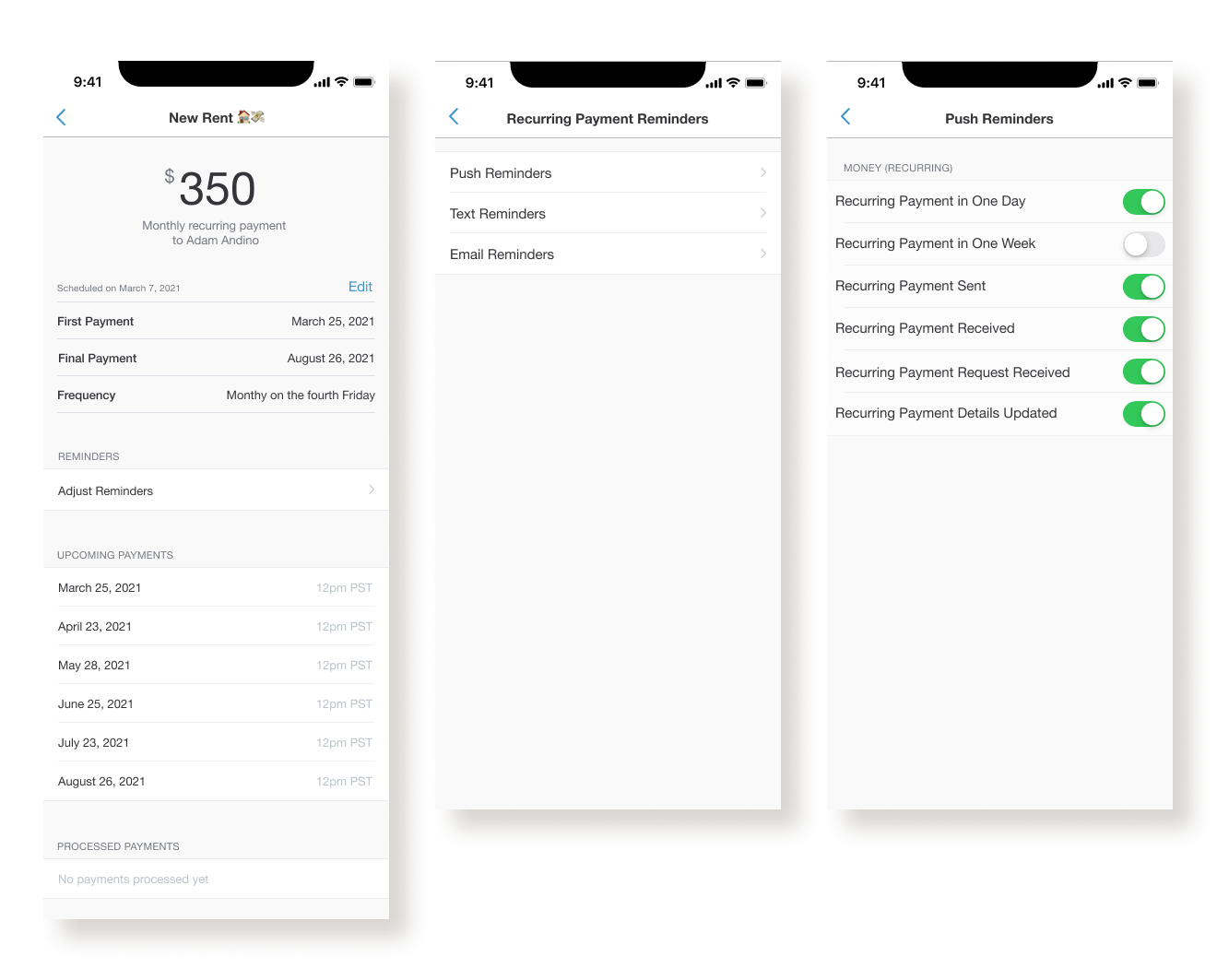
Once all screens were created and the three major user flows were established, I created a clickable prototype for usability testing. The users would be able to do the following:
Schedule a recurring payment
Adjust the end date of an established recurring payment
Locate the global reminders for recurring payments
Final prototype
Final prototype is after priority revisions, which are explained in more depth below
Test
Step 5
Usability test: 5 participants–Use Venmo regularly (at least a few times a month) and ideally, share bills with roommates or significant other
Task Completion
Set up a Recurring Payment: 100% completion. Easily understood (with some concerns about the calendar)
Adjust Recurring Payment end date: 60/70% completion. 3/5 participants found it immediately, but 2/5 went to social feed post at first
Find Recurring Payment reminder settings: 50% completion. Eventually found by all participants, but 5/5 participants first went to either recurring payments or notification within the hamburger menu
Testing Insights
Wins
All participants commented on how easy and straightforward the new feature was. It did not disrupt the normal Venmo experience and all users saw value in it
4/5 participants found the banner and did not have questions after learning more about the feature
3/5 participants would use the feature as intended. 2/5 users would not use the feature currently but would use it if they lived with roommates or shared bills with someone close
Pain points
5/5 participants had trouble locating reminders, mostly going to ‘notifications’ within the hamburger menu first, and then trying recurring payments.
3/5 participants were confused, or raised concerns, regarding the scheduling options and calendar details
2/5 participants would like to control specific reminder amounts for each recurring payments versus global reminders
Priority Revisions
Initial calendar/end date design

Redesign after usability testing


Initial global reminder setting

Redesign to individual payment reminders after testing
Initial basic, non-editable view from social feed

Redesign to editable and more functional feed view after testing

Retrospective
What I learned
Taking the simpler route isn’t always best. I initially designed a scheduling flow that offered fewer options, attempting to not overwhelm users with too many choices and offer an easy experience in general. Instead, I think I cut some corners (unintentionally) and left some users scratching their heads. By redesigning the calendar and date selection with more options and more explanation, I actually attended to a wider audience–users who are confident in what they want and select something quickly, and users who need more reassurance to better determine what they want.
Finding applicable participants is a worthy challenge. I wish I had a bit more time to carefully select my research and testing participants. While listening to Venmo users who didn’t currently live with roommates still provided good feedback, I would have liked to speak to more people who fell directly within the targeted user group.
